REDESIGNING VIDEO CALLS: A UX CASE STUDY

INTRODUCTION
The Project
In this project, I surveyed the user experience of a group of video calling apps, and chose to redesign WhatsApp’s video calling interface.
Deliverables
User surveys
User personas
User flows
Competitive analysis
Wireframing
Prototyping
User testing
Design Role
UX Design
UX Research (focus)
Visual Design
Duration
8+ weeks
Tools Used
Figma
Notion
Google Forms
When video calling, users have no indication about the status of their network connection.
THE PROBLEM
When someone’s connection fluctuates, none of the parties on call know what the issue is. This makes reconfiguring is a chaotic, lengthy process.
I designed relevant prompts and feedback that makes the user aware of their connectivity issues.
THE SOLUTION
By having this type of indication, users feel more involved in the troubleshooting process since they have a clear idea of the issues at hand. Troubleshooting therefore becomes easy and quick.
If you want to go right to the prototypes, click here.
Video calls are a huge part of everyone’s lives at this point.
CONTEXT
With COVID leading to the rise of virtual connection, especially as a college student, I video call people a lot. Every time there’s an issue with my internet, a chaotic back and forth of “hello? can you hear me?” follows. It takes a good five minutes to get back online. I find this process of reconfiguring immensely tedious.
Through this case study, I wanted to ease this process to make the whole video calling experience smoother.
I followed the 5-stage model that was originally proposed by the Hasso-Plattner Institute of Design at Stanford.
THE DESIGN PROCESS
1
Empathise
2
Define
3
Ideate
4
Prototype
5
Test
I needed to understand the users and their preferences, and evaluate if they felt any pain points.
PHASE 1: EMPATHISE
The act of video calling is done by a large demographic of people, for a large range of purposes.
I analysed pain points that exist in the video calling experience.
SECONDARY RESEARCH
Here’s what I came up with:
Absence of audio: not knowing if the other person can hear me at all.
Absence of video: not knowing if the other person can see me.
Semi-presence of audio: not knowing if they can hear me, and if I’m lagging.
Semi-presence of video: not knowing if I’m clear or pixelated.
Screen sharing: not knowing if my screen is visible to everyone.
Echoing: not knowing if my audio is echoing.
WhatsApp does not have an indication for any of the above situations, which is what leads to user frustration.
The competition did not have such indications either.
COMPETITOR ANALYSIS + THE GAP

Based on a survey I carried out, I found that Zoom, FaceTime, Meet and WhatsApp are the most commonly used apps for video calling. I found that almost none of them had this aspect of an indication about connectivity. This then became my opportunity for the solution.
I surveyed 30+ users to understand their outlook on the situation.
PRIMARY RESEARCH
I wanted to understand which apps they use the most, and if they relate, and if they thought there were any pain points that I had missed.
A few of the questions that I asked were:
What issues do you face on call, if any?
Would seeing any of the following indications help you?
“Your WiFi is causing the audio lag.”
“Your WiFi connection is weak, switching to data will help.”
I compiled key insights after asking variety of demographics, as can be seen below:

91% of people have dealt with one (or more) of the pain points.
KEY INSIGHT 1
100% of people who filled out the form thought one (or more) of the below indications would prove to be helpful.
KEY INSIGHT 2
The indications I offered to the respondents:
Your WiFi is causing the audio lag.
Their WiFi is causing the video lag.
Your WiFi connection is weak, switching to data will help.
You are successfully presenting to 13 out of 30 people in this call.
Your speaker is causing an echo.
The respondents also suggested indications they thought would be helpful.
USER SUGGESTIONS
On being asked, “do you have an indication in mind that you think would be helpful?”, here are some of the most common answers:
“having an in-built internet speed test would be really nice because it would make a convenient way to check how good our WiFi is.”
“[some indication of] which apps I need to switch off from the background to optimize the quality of network.”
“[some indication of] what percentage of required bandwidth I'm at currently to support video (when it isn't enough to support it) to know how much closer I may need to move to my router.”
To understand the users’ thoughts and actions better, I created an empathy map.
PHASE 2: DEFINE

I used the insights I found to create two user personas.
CREATING USER PERSONAS
These personas are referred to throughout the product life cycle in order to remain focused while making redesign decisions.
Meet Neha:
USER PERSONA 1

This is Neha.
Demographics: Neha is a 20 year old college student, studying architecture.
Gools: Neha uses WhatsApp to talk to her family and occasionally her friends. During COVID she had to use video calls much more frequently than she does now. She would say she video calls multiple people per day.
Motivations: Neha wants to feel ease when calling family and friends.
Frustrations: she doesn’t want to explain to her family when they get stuck. Her college’s internet connection is unstable, and she faces issues often.
Quote: “Video calling is essential to me. It’s frustrating to reconfigure over and over again, but I’m not at a place where I can stop.”
Meet Rajiv:
USER PERSONA 2

This is Rajiv.
Demographics: Rajiv is 43, and a father of 2. He works at Intel Technologies.
Uses: Rajiv uses WhatsApp to talk to family and uses Google Meet to conduct meetings. He talks to his children every day, and has meetings several times per week.
Motivations: He wants the process of setting up calls to be simpler, and he doesn’t want to face issues during his calls.
Frustrations: He’s familiar with the interface and the experience, but still not a fan of all the time-waste that happens when reconfiguring.
Quote: “Video calling is an everyday thing. I would love it if it felt more efficient.”
To visualise the users’ thought process more clearly, I created a user flow.
CREATING A USER FLOW

I asked myself — how might I create solutions to the problems that I’ve gathered so far?
PHASE 3: IDEATE
How might we…
make it clearer and
easier to know whose
end an issue is on?
How might we…
provide a detailed
diagnosis only to those
who want it?
How might we…
avoid unnecessary
back and forth between
members in a call?
With a broad outline of the user flow to get me started, I began designing wireframes.
LOW FIDELITY WIREFRAMES

PHASE 4: PROTOTYPE
Here are the final designs, arranged by experience.
Adding a separate button for connectivity issues.
EXPERIENCE 1
This button, as seen at the bottom, turns on whenever there is a network issue. Clicking it shows the user more details about the issue.

EXPERIENCE 2
Adding relevant indications.
An indication appears as and when there is an issue, and lets the user know whose end the issue is on.

Adding an overlay with basic details.
EXPERIENCE 3
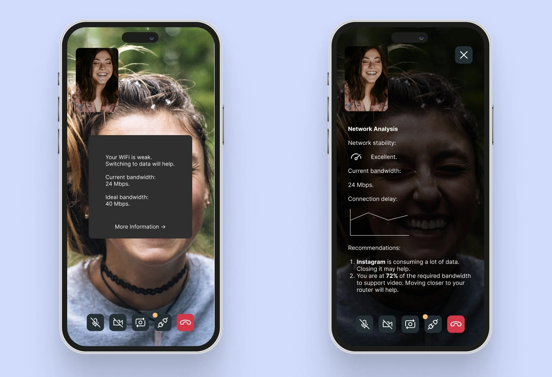
If the user clicks on the connectivity button, this overlay opens, giving the user basic information regarding their connection.

Adding an overlay with advanced details.
EXPERIENCE 4
If the user wants to know advanced details about their bandwidth, they may click the “more information” button, and get a detailed overlay about their connection status.
I gave each of my users 5 cases, and asked them if they were able to resolve each of them.
PHASE 5: TESTING
Here’s what I asked:
Were you able to resolve your network connectivity issues in one try?
Were you able to find if your screen was sharing?
Were you able to check if you were echoing?
Were you able to check if you were lagging?
I found that each of them were able to solve each issue. Some gave me feedback, which I will most definitely incorporate in the case that I come back to this project.
FINAL THOUGHTS
The Finish-Line
I’ve learnt so much from this process! As my first thorough case study, this was immeasurably fun as well as insightful for me. Following a formal design process from start to end feels rewarding. Next time perhaps I will try to integrate even more features and helpful tidbits that make the process even smoother for the users, having now learned how to have a very user-focused approach.
Thank you for making it all the way. If you have any feedback or would like to get in touch, please feel free to contact me!