InvestIQ
RUNNER-UP @ LOLLYPOP’S DESIGNATHON ‘23 · END-END PRODUCT CONCEPT
INTRODUCTION
Lollypop Design Studio’s Designathon is a 16 hour design sprint where teams are given a problem statement and have to design a product concept end-to-end and showcase the perfect solution.
DURATION
16 hours end-end. April ‘23.
DESIGN ROLE + TEAM
Team of 7. I led the UX Research and UX Design effort. Played a role in defining branding.
DELIVERABLES
User surveys + Personas
Information Architecture
Competitor Analysis
Wireframing + Prototyping
TOOLS USED
UX Figma
FigJam
Google Forms
Please note: this project is best viewed on desktop.
A LOOK AT THE FINAL DESIGNS

THE PROBLEM STATEMENT
Design a solution that streamlines the investment process for novice investors, boosting their confidence and enthusiasm when purchasing their first stock or mutual fund.
When purchasing a stock or a mutual fund, users undergo a lot of emotions — often feeling doubt and uncertainty. Our goal here was to simplify the investment process and reaffirm users that they are in safe hands.
CONTEXT
New investors often face significant barriers when entering the world of stock and mutual fund investments.
These include a lack of confidence, limited understanding of the investment process, and overwhelming amounts of information, sometimes not enough. Our guiding question was: is there a way to streamline this process for the most novice and inexperienced investors?
THE DESIGN PROCESS
We followed three main steps, which were divided further as shown:
1 DISCOVER
PRIMARY RESEARCH
SECONDARY RESEARCH
USER PERSONAS
2 DEFINE
EMPATHY MAPPING
DEFINING SOLUTIONS
INFORMATION ARCHITECTURE
3 IDEATE
WIREFRAMING
DESIGN SYSTEM
USER INTERFACE
1.1 PRIMARY RESEARCH
We conducted 15 semi-structured interviews to gain firsthand knowledge of the pain points users face when attempting to begin their investment journey.

FIGURE: INTERVIEW PARTICULARS
INTERVIEW INSIGHTS

FIGURE: INSIGHTS USED FOR THEMATIC ANALYSIS
USER INTERVIEWS: RESULTS
Here are the key insights that were found:


USER SURVEY
We also floated a short survey to kick off our competitor analysis.

FIGURE: RESPONDENT DEMOGRAPHIC

FIGURE: SURVEY RESULTS
1.2 SECONDARY RESEARCH
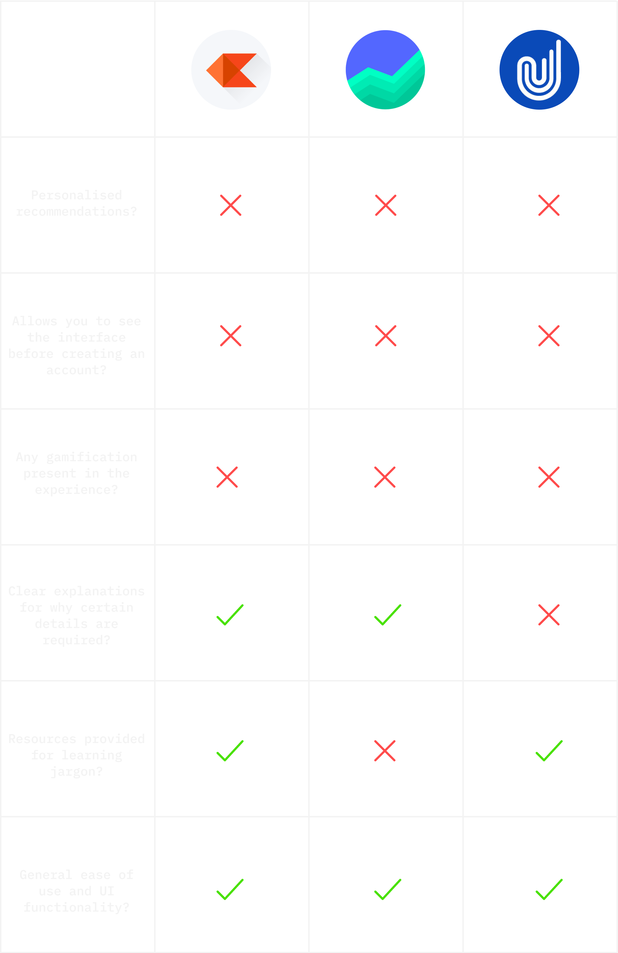
We did a competitor analysis on existing investment apps to understand what they have in common and to identify what they may be missing.

Kite by Zerodha, Groww and Upstox were some of the products we considered during the competitor analysis. These apps are among the most popular in India, and were commonly used among users that filled the survey (Zerodha and Groww) and those we interviewed (Upstox).
This is where we started crafting our solution. We zoomed in on the importance of onboarding as an important facet to bring about user retention.
SECONDARY RESEARCH
We realised that a smooth, engaging onboarding is key for user retention.

Research shows that good onboarding helps retain users — and this retention allows them to move forward and make their first investment. We realised that if our product manages to keep the user’s attention for the duration of the onboarding, they are much more likely to actually make an investment. The positive nudges toward making an investment can happen only after this phase has been passed, and that is why we really focused on this.
SECONDARY RESEARCH
We studied the financial literacy of the average Indian person to make decisions about the feature structure of the app.

One of the common trends we found from our primary research was a lack of knowledge in users about both the way that investments work, and with some of the common terminologies required in the investing world. When we researched this topic, we found the above as results. Due to this lack in financial literacy that was found, we decided to include a section in the bottom nav dedicated purely towards learning and keeping up with the market.
SECONDARY RESEARCH
We also found that gamified experiences greatly increase customer retention and satisfaction.

We wanted our product to feel friendly and interactive so that our users feel comfortable. To do so, we introduced elements of gamification. This also served as a means to retain users, as verified by secondary research.
SECONDARY RESEARCH
Finally, we also verified that personalisation positively impacts user experience.

We wanted our product to feel friendly and interactive so that our users feel comfortable. To do so, we introduced elements of gamification. This also served as a means to retain users, as verified by secondary research.
1.3 USER PERSONAS
I used the insights I found to create two user personas.
These personas are referred to throughout the product life cycle in order to remain focused while making redesign decisions.
USER PERSONA 1
Meet Raj:

This is Raj Patel.
Demographic: Raj is a 24 year old interior designer, based in Mumbai, India.
Goals: He started working 10 months ago, and believes his total income is lacking. He wants to begin investing because he knows that it can help him earn money, but there’s so much risk involved that he’s scared about starting and trusting people with his money.
Motivations: He wants to get the confidence to actually take the plunge and invest. To get familiar with the process and feel like he’s in safe hands.
Frustrations: There is so much risk involved, and he feels like there is no guarantee of his money’s safety. He opens apps and feels overwhelmed and often simply closes them.
USER PERSONA 2
Meet Anushka:

This is Anushka Gupta.
Demographics: Anushka is a 21 year old final-year engineering student, and she is from Bengaluru, India.
Goals: When COVID restricted everyone to their homes, she had some extra time to learn, and her dad suggested that she tries investing. Her dad is willing to provide any monetary support if and when required along with guidance.
Motivations: To dabble in the world of investment. To get familiar with the process and see that it’s fun and doable.
Frustrations: There are so many options of where to begin, and there are so many places to go. She doesn’t know what to do.
2.1 EMPATHY MAP
To understand the users’ thoughts and actions better, I created an empathy map.

2.2 DEFINE SOLUTIONS
Having consolidated all the pain points and keeping the users in mind, we began to define our features of our solution.
We chose to make InvestIQ a product that deals with mutual funds only. This is for a variety of reasons:

Some of the other solution features are outlined below:

2.3 INFORMATION ARCHITECTURE
Upon finalising all the key solution features are mapped out, I created the information architecture.


3.1 LOW FIDELITY WIREFRAMES
With the user flow and information architecture to get us started, we began designing wireframes.


3.2 THE DESIGN SYSTEM
Here is the design system:

3.3 HIGH FIDELITY WIREFRAMES
Here are the some of the final designs for InvestIQ.
The complete set of screens are better viewed on Figma.

EXPERIENCE 1
Categorising users during onboarding.
Through the onboarding, we wanted users to feel like they were being heard. Asking a question where the user inputs their current mental place makes the user feel seen. Categorising users during onboarding creates a customised experience, and emphasises to the user that we are listening to their needs from the start.

EXPERIENCE 2
Money personality quiz during onboarding.
To further the idea of listening before helping, we implemented a money personality quiz in the onboarding experience. This creates an engaging, gamified experience. This increases the user’s interest and their retention, and allows us to understand their preferences (like their risk appetite), without asking them directly. This also makes the user feel seen, and helps personalise recommendations on the landing page.


This also helps the user understand their own needs. A novice investor is often confused, unsure and has misconceptions about how investing works. Through the money personality result, we help the users put a finger on what they prefer. This also emphasises that we understand them and where they’re coming from.

EXPERIENCE 3
The landing page is simple and personal.
The landing page has minimal information on it to not overwhelm the user. There are filters, so the user can search for any specific funds they have in mind. The recommendations are front and centre, so the user feels like the experience is personalised. Since popular banks are listed, the user develops a sense of trust and security. On the top right corner is the user’s badge, used to provide external validation for their progress in their investing journey.

EXPERIENCE 4
There is a section for learning.
The learning page focuses on three broad topics: (1) helping users familiarise themselves with investment terminologies; (2) helping users visualise how their investments convert to returns to remove any preconceived notions about the rate of conversions; and (3), enabling users to keep in touch with the news and the market after they have made an investment.

The investment to returns calculator is an interactive system that allows users to either enter their end goal or to enter how much they want to invest per month and concretely see the rate of growth and returns. This helps users get an accurate estimate of the time it takes to get returns.

EXPERIENCE 5
The profile page allows easy viewing of smart statements.
The profile page is designed to bring about transparency. Through our research, we found that users want to know where their money has gone after making an investment. We wanted to make this information very easily accessible. Additionally, there is a button to plan your goals, which is meant to help nudge any users (who are yet to decide how they are going to go about investing) make the leap.

The profile page also has a place to plan your goals and get clarity with respect to how to go about the investment process. Having a high level of understanding and a clear plan of action to achieve a goal in mind will also gently nudge users to make their first mutual fund investment.


FINAL THOUGHTS
The Finish-Line
This journey was absolutely crazy! With the hectic 16 hour time crunch in place, it was definitely challenging to create an entire product concept, and so fulfilling to earn the Runner Up award. I learnt so much from this process. My key insight was that following an organised and well-planned design process from start to end can carry you through anything. We made a timeline in the beginning and stuck to it, and this proved to be essential for the completion of the challenge.
There are some areas that need improving — the primary one being that due to the 24-hour sprint, we were not able to carry out user testing due to potential users being unavailable. As I refine this study, I will carry out thorough user testing and improve the designs further. Again, the designs are better viewed on Figma, so I would request you to check them out on there.
I want to thank Lollypop Design Studio for making this possible. The event was very well-managed and I felt comfortable in the studio. And I want to thank you, the reader, for making it all the way 💌

